Thursday 25 October 2012

Comparing my environment art to the example I chose before (23/10/2012)

Comparing my own drawn environment to the Craig Miller's environment they clearly share similarities and differences.  
For example:

Similarities:
  • Both pieces are city landscapes with tall looming towers, some of which contain windows. 
  • Visually neither environment look like they would be particularly nice places to live in.
  • Numerous vertical lines are used in order to make the buildings in both images appear taller. 
  • Both environments have similar dark colour palettes and moods. 
  • Both give the viewer a sense of perspective as they include foreground and background which helps  the viewers eye to travel across the camvas.
Differences: 
  • In my view the images appear to represent different periods of time.
  • My environment contains numerous people, whereas Miller's has only the one person visible. I chose numerous small silhouettes because my focus was on the environment and not the characters. I also wanted the characters to not over shadow the existence of the robot. In Miller's image I assume he wanted his character to be more dominate which is why they take up so much space in the foreground.
  • My art and Miller's art are very different. My art is very animated / cartoon like and consists of fine black border lines to show the outlines of the things within my work. As so far I use little to no shading. Whereas Craig Miller's image is rather sketchy and makes effective use of light and shade. 


Referencing: 

Miller, C. (Unknown) goodbrush. Available at:
http://www.goodbrush.com/ (Accessed: 16/10/2012).

My environment art and analysis (23/10/2012)

Before starting my drawing I spent time thinking of various ideas and then did some sketches of them as you can see below:


After completing these initial sketches I then analyzed them to see which one I wanted to pick for my final piece. This involved deciding which features I could take from the ideas and what I might possibly add:
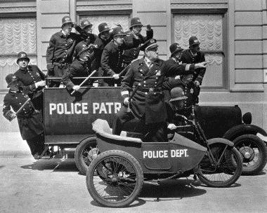
  • Maybe include the positioning of the cops as seen in the bottom left corner as their positioning seems the best.
  • Include more sky in the background of the bottom right hand image.
  • Include more steampunk aspects, cars, cops and robots. 
  • Maybe add a blimp or plane?
  • Or perhaps a river? 
The bottom right hand image ended up being my favorite and thus I decided to choose that one for my piece of environmental art.

When I did finally start my image I included a boat in the background. However, as I am still learning how to correctly use perspective I ended up not only making the boat too big, but also making the supposed ocean in the background at the wrong angle to the rest of the buildings as you can see below in the top right hand corner:

 
In the end I decided to cut out the images background instead of starting again as I had already put in a lot of work into the image and didn't want one mistake to ruin it. I'm glad that I made this decision because the image in the end accidentally ended up looking a lot better as not only did the cut around page look layered over the new piece of paper it was stuck on to, but it also gave the image a layer of depth. This is something that I could perhaps do more of in the future. 


You will have no doubt of also seen that special effects have been added to my image. These effects were created using Photoshop and include the the clouds, smoke and even the dark silhouettes which are actually me. I put myself into the image as I knew the piece of art was meant to be environment based and therefore didn't want to waste too much time on detailed characters. Plus I thought that dark silhouettes would add atmosphere to the scene. Adding myself was also quite simple. I just used some photos taken of me in a hat and trench coat in various poses (to match the drawn images) and then incorporated them onto Photoshop. Once on the program I then cut out the background and upped the contrast, thus creating dark and mysterious figures which I felt came out better than I expected.

I knew that I also wanted to add some colour to the scene but wasn't 100% sure both on how to do so and what colours to use; something that I originally didn't even think about, but in retrospect I probably should have done. After messing around with browns that would have suited a more steampunk aesthetic and failing to get it just right, I decided to use another bit of  inspiration for my scene instead, film noir as you can see below:


Now whereas it wasn't my intention to go for a film noir look I feel that its black and white misty filter really added to the overall atmosphere I was trying to create in the environmental scene.


Work Schedule:
Friday: 11:20 - 11:50, 12:20 - 14:00, 14:30 – 15:00
Saturday: 16:00 – 17:45, 19:45 – 21:20
Sunday: 18:40 – 20:25, 20:35 – 20:55, 21:00 – 21:20
Tuesday: 9:15 - 11:15

Friday 19 October 2012

Research for my environment piece of art (19/10/2012)

I want my piece of environment art to consist of the following:
  • Key stone cops from the 1912-14's.
  • Steam punk visuals and machine/robots. 
  • A city similar to Rapture from the game Bioshock.
  • Film Noir style and atmosphere along with the sort detectives in hats and trench coats that you would see in them.
Visual research:


Referencing: 

Bernard, B. (August 7, 2011) Visit to downtown Picture. Available at: 
http://digital-art-gallery.com/oid/6/640x368_2438_Visit_to_downtown_2d_sci_fi_steampunk_city_picture_image_digital_art.jpg
(Accessed: 19/10/2012) 


Brindley, A. (Unknown) Ariion Kathleen Brindley. Available at: 
http://www.ariionkathleenbrindley.com/tax-keystone.jpg
(Accessed: 19/10/2012)  

Caoili, E. (November 25, 2009) GAME SET WATCH: 1959: Rapture's Ballroom. Available at: 
http://www.gamesetwatch.com/091125-1959.jpg
(Accessed: 19/10/2012)

Dennis. (September 20, 2010) Denzomag: 18 Great Examples of Steampunk Cities Illustrations. Available at: 
http://th09.deviantart.net/fs70/PRE/i/2010/146/a/7/Tamerlane_steam_city_by_EasternVision73.jpg
(Accessed: 19/10/2012)  

Haskell, E. (June 21, 2010) Blogspot: Eddi Haskell's Second Life. Available at: 
https://blogger.googleusercontent.com/img/b/R29vZ2xl/AVvXsEgHvFK1s2aaDiNhcU0IRFifOh5mm-pYHL1pR7QgLUKFPVSavGbv_9en-f3WM1K46JE6cy9ZjxIDwkvuIlHXmMMRPYO9JhPzly6GPXRr3_O7T81z3t_ljsba_UgmEIq9TSmdpG67ywAfXAt1/s1600/Snapshot_018-1.jpg
(Accessed: 19/10/2012) 

Low, A. (April 15, 2010) Film Noir City. Available at:
http://filmnoircity.com/wp-content/uploads/2010/05/film_noir.jpg
(Accessed: 19/10/2012)  

Shapera, P. (March 30, 2011) The Steampunk Opera: Steampunk Cities, Postcards. Available at: 
http://coolvibe.com/wp-content/uploads/2010/06/steampunkcity.jpg
(Accessed: 19/10/2012)  


Unknown. (August 17, 2012) /tg/ - Traditional Games. Available at:
http://suptg.thisisnotatrueending.com/archive/20365707/thumbs/1345259865154s.jpg (Accessed: 19/10/2012)

Tuesday 16 October 2012

Environment Concept Art (16/10/2012)


Environment Concept Art
Robin Foale                 16/10/2012

I have always been a huge fan of character art due to my love of animation, therefore I have never truly looked at environment artists work before. Thus when I was asked to look at some for today’s task I was pleasantly surprised by all the amazing artwork I had missed out on by only focusing on characters for as long as I have done. 
For this task I have decided to analyse and critique the below piece of art by Craig Miller as it caught my attention in particular. 


Art by Craig Miller.

Positives:
  • The dark colour palette gives the environment an unclean and almost toxic look due to the use of greys, browns and yellow. 
  • I particularly like the fact that the artist included reflections in the window which the figure is looking out of as I think this adds believability to the work. 
  • The image creates an effective atmosphere as although you see someone looking out of the window you don’t see anyone else, thus adding a element of loneliness to a city that should otherwise be vastly populated. The loneliness is further conveyed by the figure's body language as they appear to have their arms wrapped around themselves which is usually considered a defensive stance.
  • I love the use of perspective in this image as although it is a two dimensional one it feels three dimensional thanks to the use of the figure in the foreground followed by the window in the middle and then the bridges and buildings in the far background. This is a clever way to lead the eye through the image. 

Negatives:
  • The person's back seems out of proportion to the rest of the body and her position seems unnatural. Sometimes this distortion can work, but when the art looks mostly realistic it just seems odd that the character's spine would bend quite like that.
  • I may be a huge fan of atmosphere but I am personally not a fan of the dark colour palettes that help convey this. Therefore perhaps a few more reds and blues would help to make the city feel more alive whilst still keeping the artists original vision.  

Referencing:


Miller, C. (Unknown) goodbrush. Available at:
http://www.goodbrush.com/ (Accessed: 16/10/2012).