Unfortunately due to a sickness bug in the winter of
2012 I was unable to take part in this session.
I hope
that I will be able to go back and complete the colouring of my Star Wars' art as I was really looking forward to completing the picture that I had put a lot of time into. Sadly I don't have Photoshop at home in order to complete it in my own time.
Friday 28 December 2012
Wednesday 5 December 2012
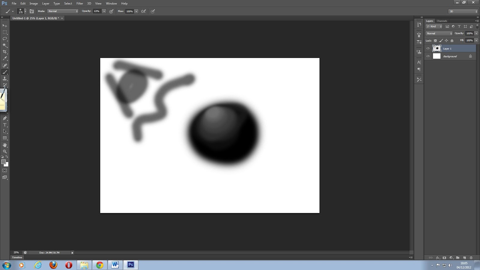
Photoshop Session 2 (4/12/2012)
Having enjoyed the last session I was really looking forward to this one as I thought I would be learning new things. Unfortunately this was not the case as we were told to practice the skills we had learned last week in order to produce a cover for a video game. Now whereas I did have fun doing this and it allowed me to remember previous skills I felt at the same time that I could have done this at any time at my own leisure.
After we had finished our covers we moved onto shading a ball similar to how we shaded the human face last week. Unfortunately I only felt this to be another practice of the skills we had already learned and nothing new.
Overall, whereas it was a fun session that allowed me to practice
my skills I felt as if we were covering old ground. Therefore I hope next time we will be able to learn something new.
You can see the evidence of my work below:


Referencing:
Paladin, D (Unknown) Castle Crasher Knights [Online image]. Available
at:
http://www.gamerzines.com/wp-content/uploads/2012/09/castle_crashers_small.png
(Accessed:
4/12/2012).
Unknown (2008) Xbox 360 box template [Online image]. Available
at: http://i207.photobucket.com/albums/bb170/Spyro4President/Xbox360Template-1.png
(Accessed: 4/12/2012).
Unknown (Unknown) Banjo and Kazooie [Online image]. Available at: http://www.therwp.com/w/images/thumb/c/c5/Banjo-kazooieBKNB2.jpg/300px-Banjo-kazooieBKNB2.jpg (Accessed: 4/12/2012).
Unknown (Unknown) Joanna Dark [Online image]. Available at:
Unknown (Unknown) Banjo and Kazooie [Online image]. Available at: http://www.therwp.com/w/images/thumb/c/c5/Banjo-kazooieBKNB2.jpg/300px-Banjo-kazooieBKNB2.jpg (Accessed: 4/12/2012).
Unknown (Unknown) Joanna Dark [Online image]. Available at:
http://www.oxmonline.com/files/u12/JoannaDark.png
(Accessed: 4/12/2012).
Unknown (Unknown) Marcus Fenix [Online image]. Available at:
Unknown (Unknown) Marcus Fenix [Online image]. Available at:
http://images.wikia.com/gearsofwar/images/1/19/Gears_of_War_3_Personajes_COG_Marcus_Fenix_V2.png
(Accessed: 4/12/2012).
Unknown (Unknown) Splosion Man [Online image]. Available at:
Unknown (Unknown) Splosion Man [Online image]. Available at:
http://static.giantbomb.com/uploads/original/0/3683/1049517-splosion_man_1.jpg
(Accessed: 4/12/2012).
Unknown (Unknown) Master Chief [Online image]. Available at:
Unknown (Unknown) Master Chief [Online image]. Available at:
http://bakarenders.com/renders/albums/userpics/22517/normal_Halo-4-master-chief-front-cover.png
(Accessed: 4/12/2012).
Unknown (Unknown) PEGI 12+ image [Online image]. Available at:
Unknown (Unknown) PEGI 12+ image [Online image]. Available at:
http://images1.wikia.nocookie.net/__cb20060221071461/finalfantasy/images/c/ca/PEGI_12.png
(Accessed: 4/12/2012).
Unknown (Unknown) Kaim Argonar [Online image]. Available at:
http://s4.zerochan.net/Kaim.Argonar.full.891686.jpg
(Accessed: 4/12/2012).
Unknown (Unknown) Fable 2 Hero and Dog [Online image]. Available at:
Unknown (Unknown) Fable 2 Hero and Dog [Online image]. Available at:
http://xboxoz360.files.wordpress.com/2008/10/fable-2-31.jpg
(Accessed: 4/12/2012).
Unknown (Unknown) Viva Pinata [Online image]. Available at:
Unknown (Unknown) Viva Pinata [Online image]. Available at:
http://images4.fanpop.com/image/polls/640000/640700_1297552376331_full.jpg
(Accessed: 4/12/2012).
Unknown (Unknown) Crackdown Agent [Online image]. Available at:
Unknown (Unknown) Crackdown Agent [Online image]. Available at:
Tuesday 4 December 2012
Research for my Star Wars piece of art (3/12/2012)
Having the time to draw my own piece of artwork I decided to base my work on one of my favourite movie franchises, Star Wars.
Wanting to capture the atmosphere and appeal of the films I looked at many existing designs and came up with the following six credit care concepts.
.jpg)
Personal and peer feedback as to which design I should choose:
Asking all my fellow peers and even my lecturer I not only found out that they all really liked my concepts, but I also got the following notes for my work.
- 1 was popular with a few of my peers as not only did it have perspective, but it also had a figure on the seat who looked as if he could be talking to the figure in front of the image. Whether this figure is meant to be intimidating or not is another thing.
- One thing that people liked about 2 was that the person appearing from behind could infact be rushing over to tell the other person at the console that something is wrong with the ship. Thus adding tension to the overall scene. And whereas this was the first idea in my head originally I feel that it may pay too close a resemblance to the well beloved Millenium Falcon as seen in the movies.
- 3 was very popular due to the image's perspective in a large open environment and the use of the triangular windows that not only looked good, but also original. They also really liked how the scene was layered and even included a mouse droid which they demanded to see in the final piece.
- Quite a few people really liked 4's perspective as not only were the two characters on different perspectives, but the one on the raised surface looks as if he could be intimidating. I intended to capture this as if I do draw this one then I would add lots of red lighting and dark backgrounds for atmosphere. My peers were also keen on the console the figure at the front is using due to its unique design, though some did confuse it for a window. The lecturer did point out however that I should avoid having background details collide with the characters, otherwise it can mess with the viewer's eyes and make them think that the two are the same thing. Therefore if I were to do this one I would have to slightly tilt everything to one side.
- Wanting to including some emotion into my scenes with hand gestures and body language, number 5 was a good example of this as you can clearly see the two figures either negotiating or arguing. Perhaps they are in the middle of a battle and/or are lost, thus explaining why they would be gesturing like this. The addition of the Astromech droid was also popular as people loved the R2-D2 look alike. A few peers liked this scene, but most felt that its angle didn't feel right, as if the scene was more a part of some set. Therefore if I were to do this image I would need to change the angle slightly.
- 6 was not only my favorite due to the homely atmosphere it creates, but was also very popular with both my peers and my lecturer who suggested that if I were to do this piece of art then I would need to use lines of perspective in order to accomplish the scale. I also recognise that I will need to give the figure with his feet up something to rest on otherwise it looks as if his legs are floating.
Overall:
As stated before 6 was my favourite and whilst it is challenging I feel that it just calls out to me to draw it. Therefore I will attempt to bring the scene to life using lines of perspective before drawing the crew, environment and objects. I recongise that I have not recently tried to draw a scene with all these features in it and therefore it should be a lengthy, but rewarding task to complete.
Thursday 29 November 2012
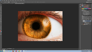
Photoshop Session 1 (29/11/2012)
Having not had much luck with the Unity sessions I was slightly hesitant to take part in another Tuesday night event. However, I enjoy using Photoshop and want to improve my skills with it, therefore I decided to give the first session a try. Having done so I am glad that I went as the lecturer was not only clear, but also knew what he was talking about and went at a pace which everyone could follow without difficulty.
Going over mainly the basics for this session ended up being a good thing for me as even though I know what a lot of the things do on Photoshop I have not experimented with everything and therefore didn't even know what some things did.
The lecturer went through each tool with us and explained to us their properties which I am glad he did as doing so introduced to me a lot of useful tools that I am sure I will use the next time I use Photoshop. To further help us he even gave out printed sheets with the shortcuts you could use on Photoshop in order to save time e.g. '[' reduces brush size and ']' increases it.
The session felt as if we covered a lot as we edited a video game character, coloured an eye in a different colour and even experimented with brushes in order to create part of a human face.
Overall, it was a very good session and one that I wish I could have stayed for longer. Therefore I look forward to the next session.
You can see evidence of my work in the session below:


Referencing:
Novák, P (2005) Eye iris [Online image]. Available at: http://upload.wikimedia.org/wikipedia/commons/thumb/6/65/Eye_iris.jpg/800px-Eye_iris.jpg (Accessed: 29/11/2012).
Unknown (Unknown) Mario jumping [Online image]. Available at: http://www.nintendo.com/sites/mario/_ui/img/home/mario.png (Accessed: 29/11/2012).
Comparing my object art to the example I chose before (29/11/2012)
Comparing my object drawing to Mike Hill's there are clearly similarities and differences.
For example:
Similarities:
- Both are curved and rounded in design.
- Both have fin-like features added to them.
- Similar colour schemes are shared between the two of them with the white/silver and gold/orange palette.
- Both have logos on them e.g. mine has stars whereas the other has a face on it.
- Both pieces of art also seem to have bits that connect to one another i.e. my space ships neck and Mike's engine.
- Both have big exhausts/engines.
- My object is more hollow than Mike's.
- You can see through Mike's window but not mine unfortunately.
- Mike's is textured whereas mine is rather smooth and has less detail.
- Mine looks new and modern whereas Mike's looks old and worn.


Referencing:
- Hill, M. (Unknown) Mini Sub. Available at: http://digital-art-gallery.com/oid/2/640x670_1364_Mini_sub_2d_industrial_design_submarine_sci_fi_picture_image_digital_art.jpg(Accessed: 20/11/2012).
Thursday 22 November 2012
My object art and analysis (22/11/2012)
Refined sketches:
For my refined sketch I decided to draw design number 2 as stated in my last post due to the fact that this design interested me the most. I'm also glad that I kept most of this design in tact as I feel that it has a very ultra modern smooth appearance about it that would possibly be ruined either visually or idea wise if anything else was added e.g. anything inside its hollow centre.
With my first refined sketch I originally tried to draw the ring from a different perspective using a roll of sellotape to trace around. However, due to my personal drawing abilities I was unable to get it at exactly the correct angle and therefore it just didn't look right. So instead of keeping with a design I was unsure of, I decided to give it another go with my second refined sketch. I am glad that I did this as although I had to change my original design for the ring I feel that it still turned out well even when I had to check the proportions for this one with a ruler. I was also able to draw a less bulky cockpit in my second design which I originally intended to do.
I decided to make a few changes to the original design, for example, I decided to add stars on to the wings and front of the cockpit so as to visually relate to the pilot I drew last time. I also decided to give the neck connecting the cockpit and the ring a rubbery flexible joint as I thought that if the ring could spin then why couldn't the cockpit move individually as well? Thus I was able to add an extra original feature to my design.
I imagine that the space ship's colour scheme would match my pilots, however, unlike my pilot I will not colour the majority of my space ship red as I fear if I do so then it will look more like a toy space ship than a realistic one. The inside of the ring, its engine and the stars will be gold so as to keep with the same metal colours of my last piece. Red will only be displayed on the rim of the cockpit's window and on the top of the ring. The rubbery neck will either be black or dark brown. Glowing orange will also return as the space ship's slip stream and lighting as seen in the centre of the circle on the ring and possibly on the window of the cockpit as reference to the pilot's helmet. Otherwise I may make the window a shiney black. The rest of the space ship will then be white as I personally feel that this colour best suits its ultra modern design and I can visualise this as the space ship's main colour.
Final Piece:
With my object finally completed I have to admit that I have mixed feelings about it. Its not that I am unhappy with its design, far from it, I am very pleased with its slick and unique appearance. However, I feel that I could have chosen a better palette of colours, or rather, chosen different colours for individual areas of the space ship as I feel that the red does exactly what I set out to avoid i.e. make it look too much like a toy space ship. This is typical as I decided against making its wings white as I had intended and instead made them red. Therefore I may want to replace most of the red with gold or white when I find the time as I feel these colours blend well together. I also felt a bit disappointed with the orange glow affects as it seems to only stand out on the engine's exhaust and not on the round orange lights in front. This is probably due to the lighter colours surrounding the round light as on the pilot the glow showed up better on the darker colours of his uniform and legs. Perhaps I just didn't make the glow strong enough.
This is not to say that they is nothing about my final drawing that I don't like. As stated before I really like its design which I was also able to clean up using Photoshop as I had originally drawn mistakes with pen on my spaceship and therefore wanted to rub them out in order to make my final piece look more professional.
I also feel that its neck looks better at the moment as not only do the colours blend well together, but the rubber looks like rubber. This was something that I really wanted to get across in the same way as the rubber looks like rubber in the character image from Shigenori Soejima which I used as reference for my last piece of art.
Outside my final piece for the space ship, I was also able to add the shading that I had originally intended for my character art on his legs and back as you can see below alongside a quick poster of the pilot and space ships side by side. I hope to go back to this mock poster at some point as due to fears of copyright infringement I decided to get rid of the space background I had originally found online and due to time constraints quickly added the black background with white dots and the rather poor flight streams as seen below. Therefore I will want to correct these and also go over the pilot in both images with a dark outline so as to not only make him stand out more, but to also bring out his cartoonish/anime look which sometimes tend to include this feature.
Overall, I feel that maybe next time I would like to challenge myself even further as even though I am not used to drawing objects I feel that I may have chosen a design that whilst slick wasn't perhaps detailed enough. Therefore when I next draw an object I will make sure to add lots of great detail and also come up with the perfect blend of colours.


Hours Spent on the drawing:
Tuesday: 16:00 - 16:30, 17:00 - 17:15
Wednesday: 20:00 - 20:20
Thursday: 14:00 - 14:20, 17:20 - 17:40, 18:10 - 18:30
Tuesday: 9:35 - 11:30
Tuesday: 9:35 - 11:30
Tuesday 20 November 2012
Research for my object piece of art (20/11/2012)
Pimp my gun:
For my first task I had to create a gun of my own design on the website 'Pimp my gun'. This was done so as to allow our creative minds to flow in the morning as well as to help us come up with ideas for when we draw our objects later.
I decided to make my gun a mixture of metal and wood as I love the design of the original Tommy gun as seen below.

You can see the result when comparing my design below to the Tommy gun above:

I then went onto Photoshop and edited the gun in order to remove certain aspects I decided I no longer liked or was unsure of. I even added a gun strap that I found online and edited it using Photoshop.
See the changes below:

Overall I like both designs for different reasons. The first one looks really big and powerful, but how one would carry this around in reality could be problematic. Therefore, perhaps it is more suitable for a stand or on top of a vehicle.
The edited gun is more compact and looks as if it could be carried more easily thanks to the added strap. I also imagine the second design to fire electrical bolts due to the part that looks like a battery of some sort situated next to the trigger, also the middle section of the gun looks similar to electrical equipment.
As I like both designs I could always say that the bottom one is the original version whilst the above one is its upgraded version.
My Object Drawing:
Having looked a number of artists that have drawn objects and vehicles, I decided to draw some type of vehicle after discovering that my original design idea of a living weapon with a personality would be too close to a character design.
Researching ideas I am torn between drawing a space ship or a submarine as the latter is hardly seen in video games. Maybe I will draw a combined version of both so as to get the best of both ideas.
I spoke with my lecturer who gave me many great ideas and details for a space ship submarine as he knew of a fictional story in which such a thing existed which could only land in water, thus explaining its multiple purposes. For example, it could have propellers and fins to help it through the water and a big engine for space travel. It could also perhaps pass through gas belts surrounding planets such as Jupiter thanks to both of these features.
The drawing below is by Mike Hill and I will use it for my reference image.

I also took the following photos for further references that I might use for my initial ideas.


Personal and peer feedback as to which design I should choose:
I first drew 6 object designs with the following reactions:
After looking over my designs I have decided to draw number 2 as, not only does its design stand out the most to me visually, but also ideally e.g. both the ring and the cockpit could individually spin around and thus allow the ship to pass through gaps and even let enemies fighters and attacks pass through its hollow center which I have never seen in a space ship before.
As for the design itself, I feel that it will be primarily known as a space ship, but will have the design and speed to get through gas clouds and water without the need for propellers, thus adding to the overall awesomeness of my idea.
Referencing:
deSantis, G (2008) 3D concept spaceship models. Available at:
http://www.igorstshirts.com/blog/conceptships/desantis_spaceship_yellow.jpg (Accessed: 20/11/2012).
Hill, M (Unknown) Mini Sub. Available at:
http://digital-art-gallery.com/oid/2/640x670_1364_Mini_sub_2d_industrial_design_submarine_sci_fi_picture_image_digital_art.jpg
(Accessed: 20/11/2012).
Schad, P (2006) spaceship unfinished. Available at:
http://fc01.deviantart.net/fs12/i/2006/310/5/b/spaceship_unfinished_by_PS_D.jpg (Accessed: 20/11/2012).
Unknown (2008) Giant Bomb: Dig Deeper into Tommy Gun. Available at:
http://static.giantbomb.com/uploads/original/1/13197/340296-tommygun_63.jpg (Accessed: 20/11/2012).
Unknown (Unknown) Rifle Strap for Airsoft Rifles. Available at:
http://www.ultimate100.net/airsoft-images/airsoft-guns-RS-1.jpg (Accessed: 20/11/2012).
Unknown (Unknown) Space Centaur Spaceship. Available at:
http://www.remotecontrolledtoys.co.uk/images/space-centaur-spaceship.jpg
(Accessed: 20/11/2012).
Unknown (Unknown) PIMP MY GUN BETA. Available at:
http://pimpmygun.doctornoob.com/app.php (Accessed: 20/11/2012).
For my first task I had to create a gun of my own design on the website 'Pimp my gun'. This was done so as to allow our creative minds to flow in the morning as well as to help us come up with ideas for when we draw our objects later.
I decided to make my gun a mixture of metal and wood as I love the design of the original Tommy gun as seen below.

You can see the result when comparing my design below to the Tommy gun above:

I then went onto Photoshop and edited the gun in order to remove certain aspects I decided I no longer liked or was unsure of. I even added a gun strap that I found online and edited it using Photoshop.
See the changes below:

Overall I like both designs for different reasons. The first one looks really big and powerful, but how one would carry this around in reality could be problematic. Therefore, perhaps it is more suitable for a stand or on top of a vehicle.
The edited gun is more compact and looks as if it could be carried more easily thanks to the added strap. I also imagine the second design to fire electrical bolts due to the part that looks like a battery of some sort situated next to the trigger, also the middle section of the gun looks similar to electrical equipment.
As I like both designs I could always say that the bottom one is the original version whilst the above one is its upgraded version.
My Object Drawing:
Having looked a number of artists that have drawn objects and vehicles, I decided to draw some type of vehicle after discovering that my original design idea of a living weapon with a personality would be too close to a character design.
Researching ideas I am torn between drawing a space ship or a submarine as the latter is hardly seen in video games. Maybe I will draw a combined version of both so as to get the best of both ideas.
I spoke with my lecturer who gave me many great ideas and details for a space ship submarine as he knew of a fictional story in which such a thing existed which could only land in water, thus explaining its multiple purposes. For example, it could have propellers and fins to help it through the water and a big engine for space travel. It could also perhaps pass through gas belts surrounding planets such as Jupiter thanks to both of these features.
The drawing below is by Mike Hill and I will use it for my reference image.
Positives:
- The curved nature of its design helps to not only give it a slick appearance, but also helps those looking at it believe that it could easily cut through water. It looks almost like a fish as it appears to have fin like additions.
- Absolutely love its circular and semi transparent window.
- Looks as if it could open and close like a fish's mouth which is a nice touch.
Negatives:
- The circles on it look too much like dents and/or bullet holes to me, and not what the artist probably intended them to be.
I also took the following photos for further references that I might use for my initial ideas.


Personal and peer feedback as to which design I should choose:
I first drew 6 object designs with the following reactions:
- The angle of 1 added a certain coolness to the design. Plus the inclusion of a lower observing deck made the ship look more layered.
- Loved number 2's hollow center as it added to the ships originality and style. Therefore I decided to include this hollowness in 4 and 6.
- 3 has a very interesting and elaborate design, especially with the two spinning rings behind it that lead some sort of trail of energy.
- The smoothness of 4 and 5 help to make these drawings look more sea worthy, as further pointed out by the bubbles coming out of them.
- 6 looked as if it it was trying to combine too many design ideas.
- May not draw 1, 4, 5 or 6 as for some reason those designs remind me of existing ones. Whether or not I subconsciously drew them from existing references in my mind I'm not sure, but I may not want to risk drawing something so unoriginal.
- Others really liked my work and said that I was a good artist which was great to hear. Though one idea that they came up with was trying to design a ship based on my original pilot sketch, thus connecting the two. They also said that they reckoned my art would best be drawn more three dimensionally as seen in 3,4 and 5. I had already recognised this, but I decided to draw 2 and 6 deliberately from a bird's eye view so as to get my thoughts down on paper.
- 7 and 11 were meant to catch aspects of my previously drawn pilot, however, whereas 11 looked more like his clothes I feel that 7's slicker design made it look less cartoon like.
- Loved the sheer scale and design of 8 as not only does it look like it could last in a fight, but it also looks as if it is perfect for agile flying thanks to its fans. However, these fans don't look as if they can turn around for underwater missions and would likely be useless in space, so considering my orignal idea I may not go with this design unless I decide to make it more space worthy.
- 9 is a longer version of 2 which I wanted to try, but felt lost its original appeal from being stretched, therefore I am glad that I gave this design a go as ideas in your head don't always go according to plan.
- 10 is a combination of 2 and 3 as demonstrated by its rings and jagged surfaces. I can already imagine this design being very popular as not only does it look unique but I think how it flies would be interesting to watch as well.
- Similar to 4 and 5, number 12 seems as if it would be perfect for diving underwater. I also love the design aspects of 2 that I included for this design. Now while I do think this is a good fun design I don't think there is enough to it for me to really put my skills into. Therefore I may leave this one for when I have more free time.
After looking over my designs I have decided to draw number 2 as, not only does its design stand out the most to me visually, but also ideally e.g. both the ring and the cockpit could individually spin around and thus allow the ship to pass through gaps and even let enemies fighters and attacks pass through its hollow center which I have never seen in a space ship before.
As for the design itself, I feel that it will be primarily known as a space ship, but will have the design and speed to get through gas clouds and water without the need for propellers, thus adding to the overall awesomeness of my idea.
Referencing:
deSantis, G (2008) 3D concept spaceship models. Available at:
http://www.igorstshirts.com/blog/conceptships/desantis_spaceship_yellow.jpg (Accessed: 20/11/2012).
Hill, M (Unknown) Mini Sub. Available at:
http://digital-art-gallery.com/oid/2/640x670_1364_Mini_sub_2d_industrial_design_submarine_sci_fi_picture_image_digital_art.jpg
(Accessed: 20/11/2012).
Schad, P (2006) spaceship unfinished. Available at:
http://fc01.deviantart.net/fs12/i/2006/310/5/b/spaceship_unfinished_by_PS_D.jpg (Accessed: 20/11/2012).
Unknown (2008) Giant Bomb: Dig Deeper into Tommy Gun. Available at:
http://static.giantbomb.com/uploads/original/1/13197/340296-tommygun_63.jpg (Accessed: 20/11/2012).
Unknown (Unknown) Rifle Strap for Airsoft Rifles. Available at:
http://www.ultimate100.net/airsoft-images/airsoft-guns-RS-1.jpg (Accessed: 20/11/2012).
Unknown (Unknown) Space Centaur Spaceship. Available at:
http://www.remotecontrolledtoys.co.uk/images/space-centaur-spaceship.jpg
(Accessed: 20/11/2012).
Unknown (Unknown) PIMP MY GUN BETA. Available at:
http://pimpmygun.doctornoob.com/app.php (Accessed: 20/11/2012).
Thursday 15 November 2012
Comparing my character art to the example I chose before (15/11/2012)
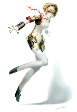
Comparing my character drawing to Shigenori Soejima's there are clearly similarities and differences.
For example:
Similarities:


Soejima, S. (Unknown) Aigis. Available at:
http://images4.wikia.nocookie.net/__cb20120804140146/megamitensei/images/thumb/e/ea/Persona_3_Aigis_4.jpg/332px-Persona_3_Aigis_4.jpg (Accessed: 6/11/2012).
For example:
Similarities:
- Artistically both characters have a very anime/manga style to them.
- Both pieces of art use the colours red and white, plus the use of gold.
- Even though my character is meant to be humanoid with prosthetic hands and legs whilst Soejima's character is meant to be completely android they both appear to have elements of a human and a machine. Whereas Soejima's character is predominantly machine as demonstrated by her joints, my character's ankles are the only indication that he has mechanical parts as you can clearly see they differ from human ankles. This is another good contrast between the characters as Soejima's drawing also has machine like ankles.
- Both drawings as mentioned before also look very human as both of them have visibly human like heads.
- Both have clothing around their necks that flow in the wind.
- The metal parts of both characters tend to be not only rounded, but also layered as you can clearly see other things underneath them.
- Both have lines on some of their material clothing in order to show realistic creases.
- The characters are different genders.
- Soejima's character has a shadow whereas mine doesn't. However, my character has the added effect of glowing lights.
- My drawing appears to be calm and relaxed, as if the character is posing for a photograph. Whereas Soejima's one looks as though she has been pictured in the middle of doing something. Perhaps she is merely landing from a height? Or maybe she is preparing herself for an ambush as her extended arms and torn clothing may make you presume.
- Admittedly Soejima has made his character's hair look really realistic as it looks layered, whereas mine is intentionally short to suit a military style hair cut, but is perhaps therefore not nearly as detailed as it could have been. Still, in my defence perhaps Soejima's character needed to have such life like hair so as to give the impression that she has human qualities and is not just a machine, whereas my person being human may not need such detail.
Referencing:
http://images4.wikia.nocookie.net/__cb20120804140146/megamitensei/images/thumb/e/ea/Persona_3_Aigis_4.jpg/332px-Persona_3_Aigis_4.jpg (Accessed: 6/11/2012).
Friday 9 November 2012
My charcter art and analysis (9/11/2012)
Clothes for Characters:
Having decided to shift my theme to a space pilot I first drew a number of different clothes and styles so as to decide what I wanted to portray in my final piece.
As you can see below I came up with both armour and material clothing for my character to wear. Most of which were deliberately circular so as to look similar to a modern space suit. This can be seen on many of the helmets and many of the bodies I have drawn.
I also decided to work on a range of helmet styles as I particularly wanted to make sure that my final choice of helmet was the most significant thing about the design.

Full Uniforms:
For my drawings of the full uniforms I
started with sketches A and B which both contained sweater style, cable knit material jumpsuits to go along side the more sci-fi type armour. After
thinking about it I decided against using so much armour on just the torso as it made the rest of the character's body look bare.
Sketches C and D have a more retro look as I decided to take the uniforms of old
World War fighter pilots and then adapt them for a
futuristic appeal. The World War style was more to do with adding a
certain patriotic and 'dashing' heroism to the uniform by the use of the open neck and unnecessary, but cool looking flowing neck tie. I wanted to give the impression of the pilot showing off the greatness of the
war effort, as seen in old World War posters or cheesy movies.
The stars on the uniforms are not only to further convey that stars are involved in the game as it is set in space, but also to show a link to one of the many symbols used by the American military.
Learning that pilots who spend many hours in the air are at risk of blood circulation problems I decided to modify my sketches in A and C to include mechanical legs which would stop blood from rushing to the lower body. This would visually show that the pilot is genetically man made. I also wanted this to be a reference to sacrifices made by soldiers in times of war. At the same time I wanted to maintain as much humanity as possible as the more human a character the more likeable they are for a gamer. Therefore, even though their legs and hands would be mechanical as well as the helmets, the rest of them would still be organic.
Refined Sketch:
For my refined sketch I decided to incorporate elements from sketches C and D as I felt that those two would make my piece of art stand out the most. This is thanks to the old world war pilot type uniforms being mixed with mechanical and therefore sci-fi hands, feet and helmet.
I decided to make the hands visibly mechanical alongside the legs as I felt they made the image stand out more. Also, in case it isn't obvious the helmet would split open in the middle in order for the pilot's head to go in and when it closes holograms would be projected inside the helmet in order to allow the pilot to see. Also when being worn the helmet would have a orange light emanating from the opening in order to make the image look even better.
I imagine that the colour scheme would be red for the uniform's material and gold for the metal as those are not only bright and stand out colours, but also reference the colours seen in the American Civil War.

Final Piece:
Overall I am incredibly pleased with my overall character design as not only does he, in my view stand out from other characters I have seen in games, but the colour scheme is also a perfect blend of my chosen colours as I made sure I kept a colour palette that mixed well together.
Talking of colours, I wanted the armour to look golden and therefore started with just a yellow colour before relishing that the program I was using (Photoshop) had the gradient tool that would allow me to stretch a gold texture over the spaces I wanted it to. I made sure I did this to each individual layer so as to give the final piece a three dimensional appearance.
Using Photoshop also allowed me to make certain areas of the piece glow with an orange haze which I am very happy with as I never thought I would be able to do that. Also, I am glad that I originally made a mistake on his legs in pen which forced me to add extra pieces to the top of his legs and actually these help to add something to what would have otherwise been rather bland.
One small thing I really like is his scarf as not only does it stand out as it is the lightest colour in the piece, but it also looks as if it is correctly flowing in the wind.
I especially love the fact that every class mate of mine told me that he he looked as if he belonged in and looked like a cartoon character. This is great news as although I drew him with a video game in mind it goes to show that my artistic style stands out enough to be recongised for other medias.
Had I had more time I might have added:
- The same shading that he has on his arms to his legs by using the gradient tool.
- Experimented with different textures and layers for his hair.
- Made his hands and lower legs more visibly machine like.
Hours Spent on the drawing:
Tuesday: 9:30 - 12:00
Wednesday: 18:00 - 18:30
Thursday: 16:00 - 16:30, 17:00 - 17:10
Friday: 13:00 - 14:30, 14:35 - 14:55
Saturday: 17:15 - 18:00, 18:30 - 19:30
Sunday: 16:20 - 17:50, 18:35 - 19:25
Tuesday: 9:10 - 12:35, 16:35 - 17:00
Sunday: 16:20 - 17:50, 18:35 - 19:25
Tuesday: 9:10 - 12:35, 16:35 - 17:00
Wednesday 7 November 2012
Research for my character piece of art 2 (7/11/2012)
Even though I drew a lot of designs for possible characters I eventually decided that I no longer wanted to use my initial idea. Why? Well I only have to draw the one character and thus trying to draw two completely different sized figures would either have been too much or taken too long even if I used photoshop.
Even though I have an idea of the game which the characters would inhabit, I find myself unable to come up with an original design for the characters.
Therefore, I have decided to draw new designs for a futuristic pilot as I feel more confident in my ability to come up with something original for a character of that description, especially since I have come up with some of the game's unique history and races already. Therefore, I am really excited about trying to bring those ideas to life with the visual style I can already imagine. This style includes uniforms from past conflicts together with elements of sci-fi. I also wish to incorporate these ideas within the background of the sketch using Photoshop if time allows. This may include a starry sky so as to help the observer understand that the character is a space pilot of some sort.

I used another fantastic image from Shigenori Soejima along with other references for my new ideas as seen below:


Referencing:
Unknown (Unknown) Luke Skywalker [Online image]. Available at:
http://4.bp.blogspot.com/-CMKxuKCycCU/T1A1ZPA0DkI/AAAAAAAAARE/rDQ2TezcJGg/s1600/skywkr_pilot.jpg (Accessed: 7/11/2012).
Unknown (2012) Scifi pilot [Online image]. Available at:
http://fc04.deviantart.net/fs70/f/2010/340/d/3/scifi_pilot_by_jamga-d34c28g.jpg (Accessed: 7/11/2012).
Unknown (Unknown) Some Future Armor Design [Online image]. Available at:
http://fc07.deviantart.net/images2/i/2004/03/6/1/Some_Future_Armor_Design.jpg (Accessed: 7/11/2012).
Unknown (2009) Daft Punk Helmet [Online image]. Available at: http://www.cabein.com/cabein/wp-content/uploads/2009/03/daft-punk-helmet.jpg
(Accessed: 7/11/2012).
Unknown (2009) Dark Void Helmet [Online image]. Available at: http://fast1.onesite.com/capcom-unity.com/user/jgonzo/18bdaa9b0523195e4c90df6dabea204d.jpg?v=219600 (Accessed: 7/11/2012).
Unknown (2011) Halo: Reach EVA Helmet [Online image]. Available at:
http://fc05.deviantart.net/fs70/f/2011/111/f/7/halo__reach_eva_helmet_by_pennnorris-d3ei592.jpg
(Accessed: 7/11/2012).
Even though I have an idea of the game which the characters would inhabit, I find myself unable to come up with an original design for the characters.
Therefore, I have decided to draw new designs for a futuristic pilot as I feel more confident in my ability to come up with something original for a character of that description, especially since I have come up with some of the game's unique history and races already. Therefore, I am really excited about trying to bring those ideas to life with the visual style I can already imagine. This style includes uniforms from past conflicts together with elements of sci-fi. I also wish to incorporate these ideas within the background of the sketch using Photoshop if time allows. This may include a starry sky so as to help the observer understand that the character is a space pilot of some sort.

I used another fantastic image from Shigenori Soejima along with other references for my new ideas as seen below:


Referencing:
Soejima, S (2007) ”Another Century’s Episode 3 The Final”
Pre-Order Illustration [Online image]. Available at: http://www.itcamefromjapan.com/assets/images/BKSOEJIMAWORKS_3.jpg
(Accessed: 7/11/2012).
(Accessed: 7/11/2012).
Unknown (Unknown) Luke Skywalker [Online image]. Available at:
http://4.bp.blogspot.com/-CMKxuKCycCU/T1A1ZPA0DkI/AAAAAAAAARE/rDQ2TezcJGg/s1600/skywkr_pilot.jpg (Accessed: 7/11/2012).
Unknown (2012) Scifi pilot [Online image]. Available at:
http://fc04.deviantart.net/fs70/f/2010/340/d/3/scifi_pilot_by_jamga-d34c28g.jpg (Accessed: 7/11/2012).
Unknown (Unknown) Some Future Armor Design [Online image]. Available at:
http://fc07.deviantart.net/images2/i/2004/03/6/1/Some_Future_Armor_Design.jpg (Accessed: 7/11/2012).
Unknown (2009) Daft Punk Helmet [Online image]. Available at: http://www.cabein.com/cabein/wp-content/uploads/2009/03/daft-punk-helmet.jpg
(Accessed: 7/11/2012).
Unknown (2009) Dark Void Helmet [Online image]. Available at: http://fast1.onesite.com/capcom-unity.com/user/jgonzo/18bdaa9b0523195e4c90df6dabea204d.jpg?v=219600 (Accessed: 7/11/2012).
Unknown (2011) Halo: Reach EVA Helmet [Online image]. Available at:
http://fc05.deviantart.net/fs70/f/2011/111/f/7/halo__reach_eva_helmet_by_pennnorris-d3ei592.jpg
(Accessed: 7/11/2012).
Subscribe to:
Posts (Atom)