Showing posts with label Sketch. Show all posts

Sunday, 7 October 2012

Demon Sketch 2 (13/9/2012)


Annotations:
  • I based the design on American trends such as Halloween and baseball.
  • As baseball is part of the character's design their pumpkin head would in fact be made out of the material used for baseballs as indicated by the stitching.
  • I deliberately wanted to make the character appear female as in it seems that women are not offen portrayed playing the sport when in fact they do. 
  • To further empasise that this is based on American culture I decided to draw a tattered American flag on her back.
  • The leaves stuffed inside the character's body would suggest autumn, whereas its stick like appendages indicate a scarecrow which can also be related to Halloween, plus it has no head, a reference to Sleepy Hallo. 
  • I also really like how the leaves stuffed inside the character float out through its loose stitching and swirl around suggesting that the figure is standing in the wind.  

Demon Sketch 1 (11/9/2012)


Annotations (top left character):
  • The figure to the top left of the screen is a combination of a action figure, an American mobster and a demon. The idea is that perhaps it is a demon summoned by someone who is childish and yet wants to be a man. Therefore the action figure parts are to display the summoner's child like side, and the mobster would be considered in their eyes as a tough ladies man, especially since he is wielding a Tommy gun in each hand.
  • I imagine the top left character to also have a pull cord on its back which you can not see.
  • The entire figure is meant to be plastic, this includes its clothing and guns. 
Annotations (bottom right character):
  • For the other figure I decided to go with a cross between a biker and a viking because... well, why not! I just thought that the combination would be cool and it turned out to be so. 
  • The character's biker side is obvious thanks to the helmet and leather jacket it wears. It also helps that it has bike engine arms and bike wheel feet.
  • Accidentally forgetting to put a bike's front light in the figure's chest I decided to make it their face instead so as to make sure it was included. This ended up working out for the better as I think its face looks even more distinguished now.  
  • Wanting to make sure that its viking side was easily noticed I decided to give the character viking axes, horns on its helmet and a viking-esque lower half. 

Dynamic Sketches! (4/9/2012)


Annotations (top left character):
  • I tried to draw a running man without using any references. For the most part it worked except for the arms that I need to work on for next time as his left arm looks really odd. 
  • I really tried to make the character look as if he was from a rural 1920's-30's age and overall feel that I accomplished this.
Annotations (bottom right character):
  • Decided to add lots of triangles so as to make it look as if the character is jumping out of a window as the pose suggests.
  • After drawing the character I deliberately chose not to give him hair as firstly he looked much cooler without it and secondly, he reminded me of John McClane from Die Hard which is also awesome. 

    Adventurer and Space Man (29/8/2012)


    Annotations (top left character):
    • I feel that the adventurer turned out pretty well considering I drew him running towards the viewer without using a reference.
    • I also decided to push the fact that he was an adventurer even more by having arrows fly past him and by giving him unwashed clothes to show the audience that he hasn't time for laundry and suggests he must have been exploring for quite a while. 
    • I made sure to try and avoid too many similarities to other well known fictional explorers such as Indiana Jones, Lara Croft and Nathan Drake by making my explorer look more casual and Caribbean as opposed to the more prepared and well organized explorers as mentioned before. However I couldn't help but give him the essential shoulder bag that most explorers have and even a hat similar to Indiana's.   
    Annotations (bottom right character):
    • With this character I wanted to make him look like a classic 'fish bowl head' space man such as people used to imagine space travelers to look like. Therefore I included the bulky, original style diving suit as his main body, a silly looking laser pistol such as the ones you would see in the 60's and breathing tubes attached to rocket like jet packs for that cartoonist rocket pack look.

    Steam Punk Pirate and Rogue (26/7/2012)


    Annotations (left character):
    • I feel that I drew all of his proportions correctly except for his head which is far too small compared to the rest of the body. This is ironic as usually it's the hands and feet I get wrong but, in this case their size it right.
    • The shoulder bag I believe came out very well as it really looks as if the bag has something heavy in it. 
    • Thinking about it I wish I had given this character goggles as most steam punk characters tend to have  a pair. They would have also helped to emphasise that the character belongs to the steam punk style.  
    Annotations (right character):
    • I really like the way the patterns in her hair and clothing came out as I feel they add a real depth and texture to her. 
    • I'm really glad that her equipment also came out well as I wanted to draw a rogue/thief and therefore wanted to equip them with a bow and weighty storage pouch.  
    • Originally drawing the bottom of her legs incorrectly with the pen I decided to save the image by making her wear metal boots with many lines going across them. Overall, I think this was a good idea as I really like the design that came out of it.

    Sci-fi Bounty Hunter and... Japanese School Girl!? (19/7/2012)


    Annotations (top left character):
    • I really enjoyed drawing my sci-fi bounty hunter but I can see that I didn't do a good job on his feet unfortunately as each one has a different design to the other. 
    • Some critics complained about the position of his head, but I personally don't mind it.    
    • I personally really like how his armour and tubing on the upper side of his body came out. Though his knee pads are a bit too close to his legs for my liking, even though one could argue that its just the baggy trousers that give this effect.
    Annotations (bottom right character):
    • I really like the creases in her top but recognise that I made them too baggy. 
    • I wish I had added more lines to the girl's skirt to make it more flowing.  
    • Feel that I accidentally made her head too masculine and her hands and feet too small. Therefore next time I try to draw a character similar to this one I need to give the character both a more feminine face and proportionate body. 

    Punks (18/7/2012)


    Annotations (left character):
    • This character's facial expressions and haircut were some of my favorites to draw as I feel that they really portray the tough guy attitude. 
    • His striped shirt would be black and red. Also I think the shirt's slanted stripes help to make it look  more realistic.   
    • Could have made the belt and scarf more detailed.
    • Although I still really like his design, I recognise that his hands are unfortunately too small. 
    Annotations (right character):
    • I love how well I drew his hoody as not only did it look like one, but it's design came out incredibly well. This also goes for his trousers as I really like how creased they look, especially since his hands are in his pockets and thus they would have an affect on the overall look of them.  
    • The hoody would be a mixture of fire related colours in order to match its fiery patterns e.g. reds, oranges and yellows. I might even add black for the middle part of the hoody and red for the bottom  and the top half of it. 
    • As I said above, I love how well this character's facial expression came out.

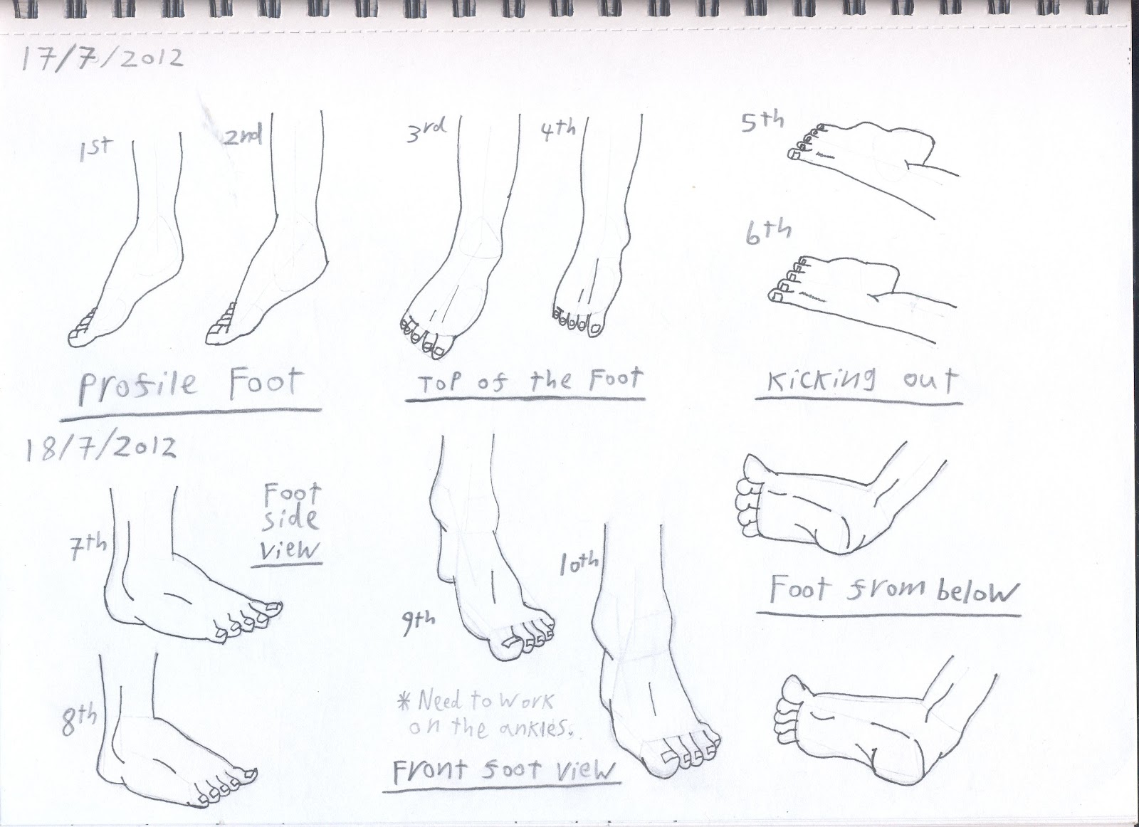
    Feet (17/7/2012)


    Annotations:
    • Even though 5 and 6 don't look the best if you look at this image upside down then they do look good which is odd to say the least as they are meant to be kicking out and therefore are meant to be seen from that angle. 
    • Overall I am quite pleased with my attempts at drawing bare feet.

    Ninja and Pirate (16/7/2012)


    Annotations (left character):
    • I love the design for this character as I feel that everything is in proportion and the clothes he wears look good.
    • Originally I drew the neck incorrectly, but in the end found that its design really added to the drawing as I turned the mistaken neck into a metal neck guard. 
    • Even though I tried my best to make him look as distinctive as possible without colour I fear that many people will compare him to the orange jumpsuit wearing ninja Naruto from the show of the same name. I believe the colours of my character's clothes would be dark green so as to blend into both dark and outside environments, thus making him more practical than a ninja wearing orange.  
    Annotations (right character):
    • I love how the creases in her trousers came out so well, although I fear they may make her legs look too short due to where the trousers stop, a mistake that I only noticed after I had finished the complete drawing. 
    • I also think that her wavy hair came out very well considering I usually struggle with such features.
    • The blade's curve helps to make the sword look more dangerous. This is something that I am pleased to see as after all she is meant to be an intimidating pirate, as demonstrated by her serious face that I really like.

    Female Jedi (13/7/2012)


    Hands and Arms (10/7/2012)


    Gas Attendant (7/7/2012)


    Surfer Dude (6/7/2012)


    Casual Teen (5/7/2012)


    Kid and Hands (3/7/2012)


    Faces and Hair (1/7/2012)


    Expressions (28/6/2012)


    First attempt at sketching (25/6/2012)