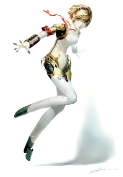
Usually he does anime/manga type drawings, but I love his detailed rendition of the android Aigis below as this is the version of her that he always wanted in the game 'Persona 3'.
He stated in (Shigenori Soejima Art Works 2004-2010) :
"This illustration represents the most faithful reproduction of the Aigis that I originally imagined." (June 2010)
I just love how detailed this version is of Aigis which include the following aspects:
Positives:
- All the fine intricate details such as the stitching, joints and facial features.
- The shading and the cuts on the material clothing her really make it look as though it is actual fabric.
- The hair has obviously been the subject of numerous stages which have resulted in the right kind of shading and layering. Thus making it look realistic.
- Her joints are wonderfully detailed as can be seen in the shoulder. However, unlike the hair her joints represent machine like connections and appear metallic and hard. This convinces those that are looking at the drawing that all the joints would help her move in a variety of directions. The thighs appear both springy and flexible enough to deal with different movements. This is achieved as the thighs look rubbery and appear to function rather like a pair of bellows.
- In short, Shigenori Soejima is able to perfectly contrast metal, fabric, skin and hair convincingly by using skillful art techniques.
Negatives:
- Her shadow in the bottom right hand corner is perhaps not nearly as big or detailed as it should be realistically. Perhaps this was deliberate or may be as a result of the light source.


Personal Idea:
I know that I want to include a mech in my art but am not 100% sure how to within the context of my game idea. One idea I have is that a posse of cowboys come across a steampunk type mech that they use in order to accomplish A-Team type missions within tactical turn based combat.
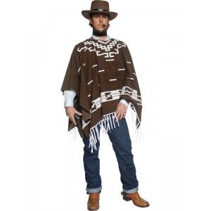
When coming up with possible ideas for the character designs I used the following photos for reference as I wanted to begin by drawing a cowboy.


Personal and peer feedback as to which design I should choose:
I first drew 6 character designs with the following reactions:

- Liked the pose of 1, but felt that he should have been siting down.
- Liked the design of 4 and 6.
- Preferred the character to be wearing the poncho as seen in 2 and 4.
- Need to make sure the steampunkish robot is made of materials that would be appropriate to the cowboy era.
- The robot should also look quite blocky and not smooth like modern machines e.g. make it look like a Generation 1 Transformer as seen below.
- Think having the character sitting on the robot's shoulder would be pretty cool.
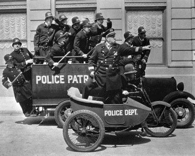
- Possible make the proportions of the character similar to the three cowboys directly above this section.

Then I drew another 6 character designs which got these reactions:

- Personally I think sketch 11 is a really good idea, the only down side is that you only see the robots hand.
- I'm tempted to give the character an eye patch as seen in 10.
- I like the positioning of the characters in 7, even though the robot is too small for my liking.
- People loved the robot's design in image 12, but I fear it is too close to my reference seen below.

Overall:
I may want to incorporate both a character and a robot, but draw them both separately and then scan them into photoshop in order to make them both a part of the same image. This way I would make sure that each drawing is as detailed as possible.
Referencing:
Moylan, M (2011) Shigenori Soejima Art Works 2004-2010. Canada: UDON Entertainment Corp.
Soejima, S (Unknown) Aigis on a book cover. Available at:
http://edmosphere.injeksionline.com/wp-content/uploads/2012/01/tumblr_lpbbg1Enx11qgrgvgo1_1280-1024x948.jpg (Accessed: 6/11/2012).
Soejima, S (Unknown) Aigis. Available at:
http://images.wikia.com/megamitensei/images/e/ea/Persona_3_Aigis_4.jpg (Accessed: 6/11/2012).
Unknown (Unknown) A cowboy is sitting on a bench with a gun in his hand. Available at:
http://image.shutterstock.com/display_pic_with_logo/217465/217465,1305135204,2/stock-photo-a-cowboy-is-sitting-on-a-bench-with-a-gun-in-his-hand-77397025.jpg (Accessed: 6/11/2012).
Unknown (Unknown) Deguisement Western Cowboy . Available at:
http://www.festimania.fr/7012-3921-large/deguisement-western-cowboy-poncho.jpg (Accessed: 6/11/2012).
Unknown (Unknown) Cowboy Silhouettes. Available at:
http://www.google.co.uk/imgres?hl=en&authuser=0&biw=1366&bih=665&tbm=isch&tbnid=G-4DqNKnAXjKmM:&imgrefurl=http://www.polycount.com/forum/showthread.php%3Ft%3D74716%26page%3D13&docid=Uzgy98MxO9uYJM&imgurl=http://img.photobucket.com/albums/v216/zenarion/tf21850_cowboySilhouettes.jpg&w=600&h=422&ei=I_mfUJb0GOTH0QWsioHoAg&zoom=1&iact=hc&vpx=185&vpy=196&dur=145&hovh=188&hovw=268&tx=207&ty=94&sig=114205264093602267420&page=1&tbnh=135&tbnw=198&start=0&ndsp=17&ved=1t:429,r:0,s:0,i:67
(Accessed: 6/11/2012).
Unknown (Unknown) Ironhide. Available at:
http://tfwiki.net/mediawiki/images2/thumb/2/25/Ironhideg1guido.jpg/300px-Ironhideg1guido.jpg
(Accessed: 6/11/2012).
Unknown (2010) Robot Cowboy. Available at:
http://www.google.co.uk/imgres?hl=en&authuser=0&biw=1366&bih=665&tbm=isch&tbnid=2ezbrS1OE9g91M:&imgrefurl=http://www.the-real-alpha2.com/lensflare3.html&docid=RZGcFZwPhD7AtM&imgurl=http://the-real-alpha2.com/images/bnw/robotcowboy.jpg&w=500&h=688&ei=DPSfUOCJNOW10QWl2ICQBg&zoom=1&iact=hc&vpx=739&vpy=120&dur=61&hovh=263&hovw=191&tx=98&ty=108&sig=114205264093602267420&page=1&tbnh=145&tbnw=105&start=0&ndsp=19&ved=1t:429,r:3,s:0,i:75
(Accessed: 6/11/2012).
Unknown (Unknown) A cowboy is sitting on a bench with a gun in his hand. Available at:
http://image.shutterstock.com/display_pic_with_logo/217465/217465,1305135204,2/stock-photo-a-cowboy-is-sitting-on-a-bench-with-a-gun-in-his-hand-77397025.jpg (Accessed: 6/11/2012).
Unknown (Unknown) Deguisement Western Cowboy . Available at:
http://www.festimania.fr/7012-3921-large/deguisement-western-cowboy-poncho.jpg (Accessed: 6/11/2012).
Unknown (Unknown) Cowboy Silhouettes. Available at:
http://www.google.co.uk/imgres?hl=en&authuser=0&biw=1366&bih=665&tbm=isch&tbnid=G-4DqNKnAXjKmM:&imgrefurl=http://www.polycount.com/forum/showthread.php%3Ft%3D74716%26page%3D13&docid=Uzgy98MxO9uYJM&imgurl=http://img.photobucket.com/albums/v216/zenarion/tf21850_cowboySilhouettes.jpg&w=600&h=422&ei=I_mfUJb0GOTH0QWsioHoAg&zoom=1&iact=hc&vpx=185&vpy=196&dur=145&hovh=188&hovw=268&tx=207&ty=94&sig=114205264093602267420&page=1&tbnh=135&tbnw=198&start=0&ndsp=17&ved=1t:429,r:0,s:0,i:67
(Accessed: 6/11/2012).
Unknown (Unknown) Ironhide. Available at:
http://tfwiki.net/mediawiki/images2/thumb/2/25/Ironhideg1guido.jpg/300px-Ironhideg1guido.jpg
(Accessed: 6/11/2012).
Unknown (2010) Robot Cowboy. Available at:
http://www.google.co.uk/imgres?hl=en&authuser=0&biw=1366&bih=665&tbm=isch&tbnid=2ezbrS1OE9g91M:&imgrefurl=http://www.the-real-alpha2.com/lensflare3.html&docid=RZGcFZwPhD7AtM&imgurl=http://the-real-alpha2.com/images/bnw/robotcowboy.jpg&w=500&h=688&ei=DPSfUOCJNOW10QWl2ICQBg&zoom=1&iact=hc&vpx=739&vpy=120&dur=61&hovh=263&hovw=191&tx=98&ty=108&sig=114205264093602267420&page=1&tbnh=145&tbnw=105&start=0&ndsp=19&ved=1t:429,r:3,s:0,i:75
(Accessed: 6/11/2012).